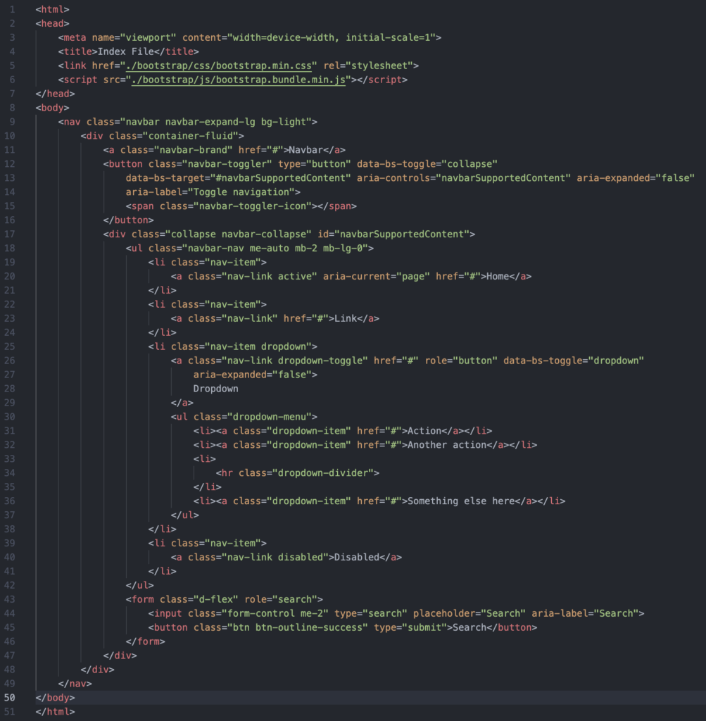
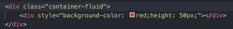
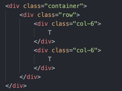
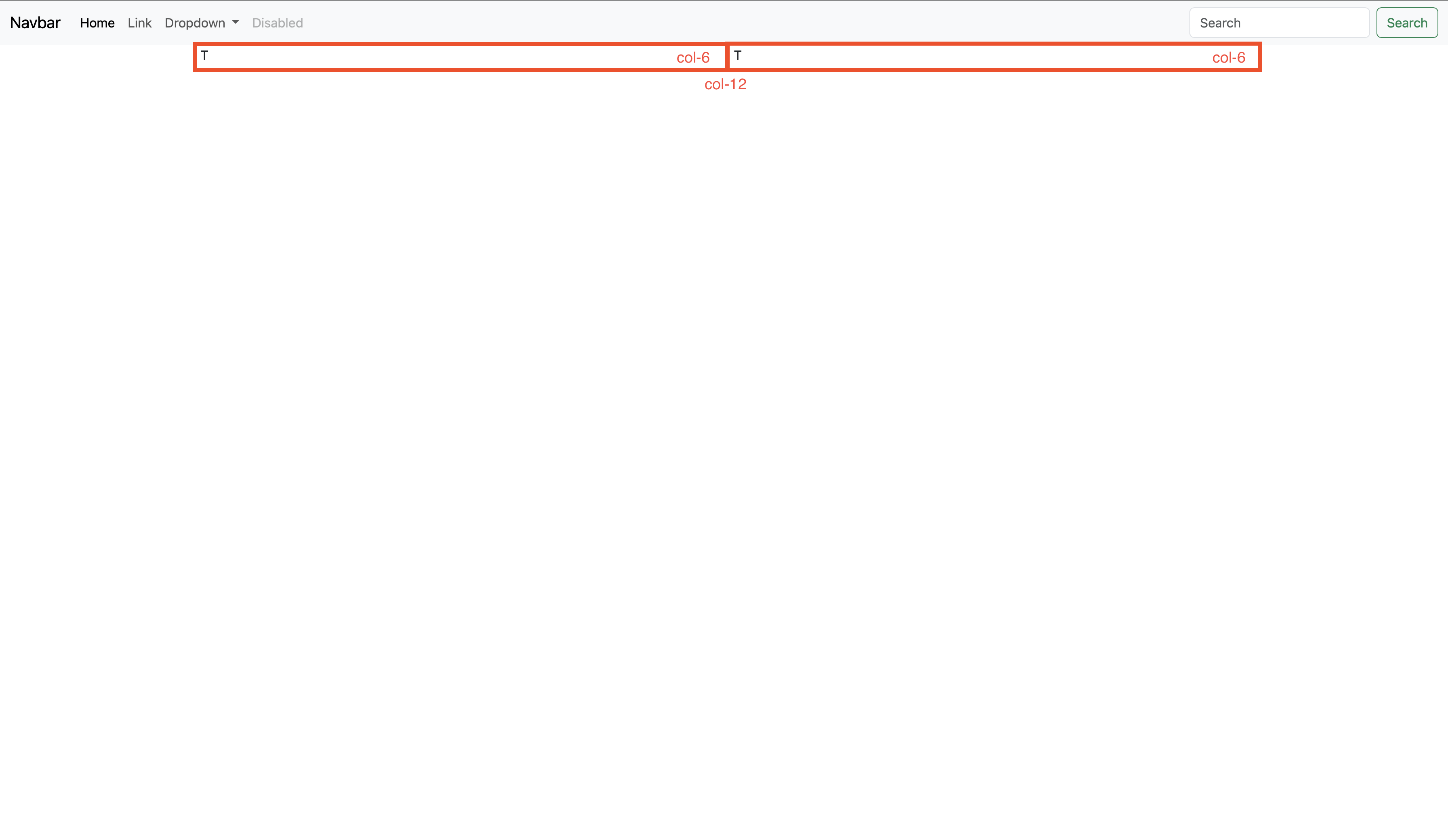
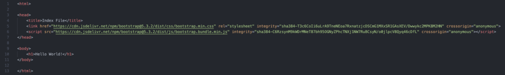
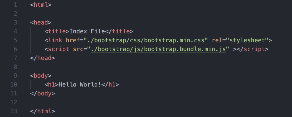
บทความนี้ไม่เหมาะกับผู้ที่ไม่มีพื้นฐาน
HTML เบื้องต้น
บทความนี้เราจะมาเริ่มใช้ Bootstrap ซึ่งเป็น Frontend Framework ตัวหนึ่ง ซึ่งจะทำให้หน้าเว็บของคุณมีความสวยงามมากยิ่งขึ้นโดยที่คุณไม่ต้องเสียเวลากับการเขียน CSS เอง และนอกจากนี้ Bootstarp ยังมีความ Responsive สามารถใช้งานได้กับทุกขนาดหน้าจอบนอุปกรณ์ต่าง ๆและยังมี layout ทำให้สามารถจัดการ Layout บนขนาดหน้าจอต่าง ๆ ได้ง่ายขึ้นอีกด้วย
Let's Start
ก่อนอื่นเลยให้สร้างไฟล์ html เปล่า ๆ ขึ้นมาก่อน โดยภายในให้กำหนดโครงสร้างหลักให้ครบดังนี้
*Note ชื่อไฟล์ที่เป็นหน้าแรกควรตั้งชื่อว่า index เพราะโดยปกติ Webserver จะมองไฟล์ที่ชื่อ index ก่อนเป็นมาตรฐาน
![](https://blogs.wutthiphon.space/wp-content/uploads/2023/10/Screenshot-2566-10-01-at-22.21.54.png)
จากนั้นให้ทำการ import Bootstrap 5 มาใช้โดยมีวิธี import ทั้งหมด 2 วิธี (ให้เลือกวิธีใดวิธีหนึ่ง)
- CDN – Content Delivery Network (CDN) วิธีนี้จะไม่จำเป็นต้องโหลดไฟล์ Bootstrap มาลงเครื่อง (ข้อเสียคือเมื่อไม่มีอินเทอร์เน็ตจะไม่สามารถใช้งานได้)
- Local File – เป็นการ import ไฟล์โดยต้องโหลดไฟล์ Bootstarp 5 ทั้งหมดมาไว้บนเครื่องก่อนจึงจะสามารถใช้งานได้ (ข้อดีคือเมื่อไม่มีอินเทอร์เน็ตก็ยังสามารถใช้งานได้อยู่)
1. CDN
ใน tag <head> ให้ทำการเรียก CSS และ JS ของ Bootstrap 5 โดยใส่ดังนี้
![](https://blogs.wutthiphon.space/wp-content/uploads/2023/10/Screenshot-2566-10-01-at-22.30.38-1024x153.png)
<!-- Bootstrap 5 CSS --> <link href="https://cdn.jsdelivr.net/npm/bootstrap@5.3.2/dist/css/bootstrap.min.css" rel="stylesheet" integrity="sha384-T3c6CoIi6uLrA9TneNEoa7RxnatzjcDSCmG1MXxSR1GAsXEV/Dwwykc2MPK8M2HN" crossorigin="anonymous"> <!-- Bootstrap 5 JS --> <script src="https://cdn.jsdelivr.net/npm/bootstrap@5.3.2/dist/js/bootstrap.bundle.min.js" integrity="sha384-C6RzsynM9kWDrMNeT87bh95OGNyZPhcTNXj1NW7RuBCsyN/o0jlpcV8Qyq46cDfL" crossorigin="anonymous"></script>
2. Local File
ให้เข้าไปที่ Website ของ Bootstrap 5 จากนั้นคลิกที่ Download
![](https://blogs.wutthiphon.space/wp-content/uploads/2023/10/Screenshot-2566-10-01-at-22.35.09-768x445.png)
![](https://blogs.wutthiphon.space/wp-content/uploads/2023/10/Screenshot-2566-10-01-at-22.35.19-1024x511.png)
จากนั้นจะได้ไฟล์ zip มาให้แตกไฟล์ออก แล้วนำไฟล์ไปใส่ในโฟลเดอร์เดียวกับ Website (สามารถเปลี่ยนชื่อโฟล์เดอร์ภายในได้)
![](https://blogs.wutthiphon.space/wp-content/uploads/2023/10/Screenshot-2566-10-01-at-22.40.45-141x300.png)
ต่อมาให้เปิดไฟล์เว็บไซต์ขึ้นมา ในที่นี้คือ index.html แล้วใช้วิธีการเดียวกับ cdn คือ import เข้าแต่ให้เรียกจากข้างในแทน เช่นในกรณีดังรูป
|-- index.html |-- bootstrap |-- css |-- ... .css |-- js |-- ... .js
โดยไฟล์ที่เราจะใช้คือไฟล์ bootstrap.min.css และ bootstrap.bundle.min.js ซึ่งจะรวม components และ library ต่าง ๆ ที่จำเป็นไว้ให้แล้ว แต่ถ้าต้องการทั้งหมดให้ใช้ไฟล์ bootstrap.css และ bootstrap.bundle.js
![](https://blogs.wutthiphon.space/wp-content/uploads/2023/10/Screenshot-2566-10-01-at-22.47.47.png)
กำหนด viewport ให้หน้าเว็บด้วย (ทั้ง 2 วิธี)
<meta name="viewport" content="width=device-width, initial-scale=1">
width=device-width ใช้สำหรับปรับความกว้างของหน้าเว็บให้ปรับขนาดตามความกว้างของหน้าจออุปกรณ์
initial-scale=1 ใช้สำหรับกำหนดระดับการซูมเริ่มต้นเพื่อหน้าเว็บถูกโหลดโดยเบราเซอร์
![](https://blogs.wutthiphon.space/wp-content/uploads/2023/10/Screenshot-2566-10-01-at-22.54.12-1024x424.png)
เริ่มวาง Layout กัน (Body)
หลังจาก import Bootstrap 5 มาแล้วให้ลองเรียกใช้ Components มาใช้ดู โดยสามารถดูได้ที่ Bootstrap 5 – Components
![](https://blogs.wutthiphon.space/wp-content/uploads/2023/10/Screenshot-2566-10-01-at-22.57.43-331x1024.png)
เริ่มจากการนำ Navbar มาทำเมนูของ Website
![](https://blogs.wutthiphon.space/wp-content/uploads/2023/10/Screenshot-2566-10-01-at-22.59.16-1024x287.png)
โดยเราสามารถนำ Code ตัวอย่างจากเว็บ Bootstrap มาใช้ได้เลย โดยจะต้องใส่ในส่วนของ Body
<nav class="navbar navbar-expand-lg bg-light">
<div class="container-fluid">
<a class="navbar-brand" href="#">Navbar</a>
<button class="navbar-toggler" type="button" data-bs-toggle="collapse" data-bs-target="#navbarSupportedContent" aria-controls="navbarSupportedContent" aria-expanded="false" aria-label="Toggle navigation">
<span class="navbar-toggler-icon"></span>
</button>
<div class="collapse navbar-collapse" id="navbarSupportedContent">
<ul class="navbar-nav me-auto mb-2 mb-lg-0">
<li class="nav-item">
<a class="nav-link active" aria-current="page" href="#">Home</a>
</li>
<li class="nav-item">
<a class="nav-link" href="#">Link</a>
</li>
<li class="nav-item dropdown">
<a class="nav-link dropdown-toggle" href="#" role="button" data-bs-toggle="dropdown" aria-expanded="false">
Dropdown
</a>
<ul class="dropdown-menu">
<li><a class="dropdown-item" href="#">Action</a></li>
<li><a class="dropdown-item" href="#">Another action</a></li>
<li><hr class="dropdown-divider"></li>
<li><a class="dropdown-item" href="#">Something else here</a></li>
</ul>
</li>
<li class="nav-item">
<a class="nav-link disabled">Disabled</a>
</li>
</ul>
<form class="d-flex" role="search">
<input class="form-control me-2" type="search" placeholder="Search" aria-label="Search">
<button class="btn btn-outline-success" type="submit">Search</button>
</form>
</div>
</div>
</nav>
![](https://blogs.wutthiphon.space/wp-content/uploads/2023/10/Screenshot-2566-10-01-at-23.02.27-1003x1024.png)
เมื่อลองเปิดไฟล์ index.html ผ่าน Web Browser ดูจะได้ผลดังนี้
![](https://blogs.wutthiphon.space/wp-content/uploads/2023/10/Screenshot-2566-10-01-at-23.03.15-1024x594.png)
Container
Container ใช้กำหนดส่วนที่จะทำเนื้อหาโดยจะมี 2 รูปแบบ และเรียกใช้เป็น class
Grid - Layout
1 | 2 | 3 | 4 | 5 | 6 | 7 | 8 | 9 | 10 | 11 | 12 |
---|---|---|---|---|---|---|---|---|---|---|---|
col-12 | |||||||||||
col-6 | col-6 | ||||||||||
col-4 | col-4 | col-4 | |||||||||
col-3 | col-3 | col-3 | col-3 | ||||||||
col-2 | col-2 | col-2 | col-2 | col-2 | col-2 | ||||||
col-1 | col-1 | col-1 | col-1 | col-1 | col-1 | col-1 | col-1 | col-1 | col-1 | col-1 | col-1 |
col-5 | col-7 | ||||||||||
col-8 | col-4 |
ลองทำโครงคร่าว ๆ
1 | 2 | 3 | 4 | 5 | 6 | 7 | 8 | 9 | 10 | 11 | 12 |
---|---|---|---|---|---|---|---|---|---|---|---|
col-12 – Navbar | |||||||||||
col-3 – Side Nav | col-9 – Content | ||||||||||
col-12 – Footer |
การกำหนดอัตราส่วนในขนาดหน้าจอต่าง ๆ
![](https://blogs.wutthiphon.space/wp-content/uploads/2023/10/Screenshot-2566-10-01-at-23.37.17-1024x385.png)
ในกรณีที่เราไม่กำหนดขนาด จะถือว่าขนาดนั้นเป็นขนาด default โดยนับจากเล็กที่สุด เช่น
<div class="col-12 col-md-6"></div>
หมายความว่ากรณีที่ขนาดหน้าจอมีขนาดใหญ่กว่า md จะแสดงผลเป็น 6 ช่อง แต่หากเล็กกว่านั้นจะแสดง 12 ช่อง
การวาง Container & Row & Column
![](https://blogs.wutthiphon.space/wp-content/uploads/2023/10/Screenshot-2566-10-01-at-23.42.21-1024x469.png)
การวาง Container & Row & Column แบบ Nesting Column (ซ้อน row ใน column)
![](https://blogs.wutthiphon.space/wp-content/uploads/2023/10/Screenshot-2566-10-01-at-23.42.27-1024x466.png)